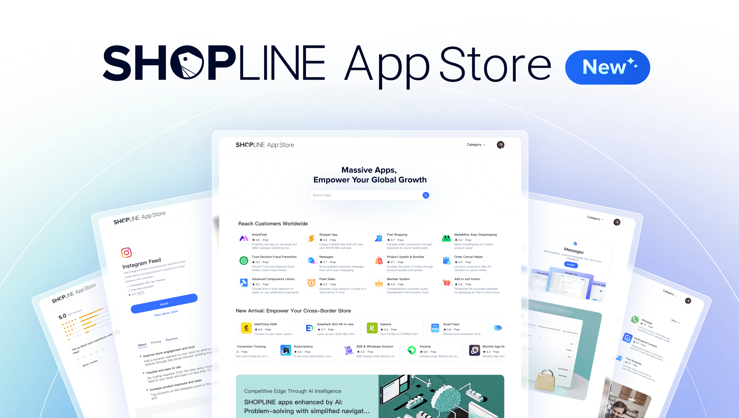
At SHOPLINE, we’re continuously looking for different ways to make the experience of using SHOPLINE easier and more delightful for our customers and users. That’s why I’m thrilled to share some of the latest updates coming to the SHOPLINE admin console.
We took a deeper dive into the experience of our admin UI to make enhancements that go beyond just the aesthetics, but really honing in on adding value for merchants who run their online businesses on our platform:

After analyzing how thousands of merchants use the SHOPLINE admin console, we identified several opportunities to reduce friction. Many merchants manage stores across multiple devices, juggle large product catalogs, and need to make quick decisions—all while keeping operations running smoothly. The interface needed to keep up with those demands.
Visual Clarity That Works Harder For YouA complete redesign of the visual hierarchy to help users focus their eyes on the most important components to enhance efficiency was where we started. A more balanced composition between the information density and white space makes it easier to quickly read the interface, and reserving the more vibrant, accent colors makes it easier to identify key actions to take.This creates a more natural, visually guided experience across the entire interface.
Intuitive, color-coded modules and enhanced typography (now clearer across all languages) makes it easier for users to quickly understand the interface, and enables them to spend almost no time deciphering where the controls are or how to take key actions.

More meaningful interactions
Every click and scroll should feel intentional and for a clear purpose. The unified treatment and behavior of all buttons, the introduction of semi-modal popups to maintain context, and streamlined the settings page with one-step left-side navigation achieves a more natural workflow.
For merchants handling large datasets, tables now display up to 18% more rows per screen, making it easier for those who seek to bury themselves in data. A refreshed components library is not optimized across all device types and sizes, making it 20 to 25 percent faster to process order and product management workflows.

Accessibility is also a focus
Implementing a sharper, WCAG-compliant color palette and softer 8px corner radii aren’t just aesthetic—they make interactions more accessible and visually calming user experience.
The new enhancements immediately had tangible impacts:
But beyond metrics, it’s about boosting user confidence and delight. Making it easier for users to get familiar and efficient with our console, gives them more energy and time to focus on the more important things… running and scaling their businesses.

This is just the start of a continuous effort of improving the user experience on the admin console and across all SHOPLINE apps and products. We’re constantly soliciting feedback and listening to our users, ensuring that we continue to provide value and improve our products in a way that aligns with their business objectives. We’re hyper focused on “experience-driven” designs and enhancements, enforced by three key metrics:
● Operational Efficiency Index (OEI)
● Interface Friendliness Score (IFS)
● Task Completion Rate (TCR)
Our goal is to create an experience-first, continuously evolving system that sets a new standard for both efficiency and usability.
If you are already a SHOPLINE user or customers, feel free to explore the new updates in your console.


Get our free guide to build a successful online store and scale your ecommerce business.
© Copyright 2013-26 SHOPLINE